😅

Size matters!

Please don’t review my portfolio on this small screen, as it is not yet developed to manage responsiveness, he.


Here, have a burrito 🌯 for your journey thorough your desktop.

We need more users

An approach based on critical thinking to find the best way to meet a goal

Every product wants constant growth. But the trick could be not in increasing the marketing budget but in improving the conversion flow and retention % of users through impecable usability so the user can achieve its goals with the least possible frictions.


Whenever I get asked "Why UX/UI is important?" I mention the impact it can has in the whole product/business. UX can mean success or failure.


It is the responsability of the Product Designer to cuestion every task and complement it with its product knowledge to define the best approach to deliver the best outcome. Also there is a need of collaboration with the stakeholders to understand their inputs and persuade them with the best decisions.

My role Platforms
Product Manager
· Data Research/Understanding/Interpretation
· Improvements Prioritization
· Goals definition
· Metrics for Success Definition
· Development Management alongside other priorities
Product Designer
· User Research
· Iteraction Design
· Usabiliy Testings
· Iteration based on Interviews Results
· A/B Testing

Challenge and Current Situation

The CEO wanted more users (and which product didn’t?) so the first approach was thinking about increasing the marketing budget but I gave my opinion (as a connoisseur about the current state of the product, majorly talking about the improvement areas that haven’t been touched yet).


I gathered the main stakeholders: CEO, Head of Marketing and a Senior Tech (he wanted to become a PM and had a deep understanding about the tech debt) and explained my point of view about the need to improve the foundations of new users, explaining the current situation and the several issues we already had: from communication to functionality problems.

Goal

We studied the context of the task and defined the best approach:


— Identify the different user stages and increase the conversion % ratio of each of them. —


We realized there were plenty of technical debt in this main flows and wanted to impove them to prepare the path for an increase in the marketing budget: a better conversion/retention would lead to a more effective investment.

My Role

As this initiative was my idea I persuaded my marketing and tech partners to collaborate and work together in this improvement, I was the head of the project:


🤓

Lead the Understanding and Tasks Definition

Checkpoints with Stakeholders

🎛

Create in collaboration with other team members

📝

Process documentation for future references

🎯

Improvements Definition

🪄

Solutions Design and Testing

💼

Define and Measure Success

⚙️

Push improvements to development

Design Process

1. Empathize

· Interviews


· Shadowing


· Funnels Analysis


· Surveys


2. Define

· Project Goals Definition


· Contrains Understanding

3. Ideate


· Sketches


· Feedback


· Screen Flows


· Ideation Workshop

4. Prototype


· Rapid Prototyping


· UI Magic


· Components Design


5. Test


· Usability Testings


· Iterations


Breakdown

The approach we took was to, before anything else, define the user stages to understand the different steps our user had on its journey, being them:


Stage Definition
1. Strange A user which has no idea about Swap, but somehow they will.
2. Retargeting Prospect Users that have heard about Swap but haven’t become users yet.
3. Inactive User Already downloaded Swap but haven’t made a payment.
4. Basic Users Users with transactions (but not constant - monthly).
5. Heavy Users Users that make more than 10 payments per month.


The next step was focusing on which users we would be working on:


— 3. Inactive Users. —


  1. This decision was made as we found that the major % of drop outs were located at this stage.
  2. We needed a better understanding of what happened with these users, so we did another stages definition.
  3. These stages were defined mostly because of the key actions that they did: app download, sign up, KYC, etc.

Inactive Users Stages

This stage had its own sub-stages and needed to be defined to have a better understanding of each sub-step the user needed to go through:


Stage Definition
1. First Open When the user downloads Swap, opens it for the 1st time and leaves it there.
2. User Created When the user creates its account.
3. KYC When the user finishes the KYC (Know Your Customer) process.
4. Add a Card When the user registers a card in order to make a payment with it (at the moment, this was more relevant than topping up its balance via wire payment).
5. Make a Payment At last! The user send money to anyone (swap user or any bank account) from anywhere (balance or debit/credit card).


– With this stages already identified we were able to measure the current conversion rate, and by having this information we were also able to define how much % we would increase the conversion rate in each stage and the implications of achieving it.

Solution

We had 5 different stages and we wanted to improve them fast, but before any solution we needed to have a deeply understanding of the user at each of these stages, so we defined a qualitative research tool:


🔍 User Interview

3-5 different users for each stage.


🎯 What we wanted to accomplish with this interviews:

  1. Understand why the users got until there (but not further).
  2. Which ones were the top issues causing these users to stop their journey.
  3. Define how we would find out which issues had more impact in our users: the tool we chose because of practicality was a quantitative one: surveys.
  4. Also we did research with heat maps (Android) and granular funnels with specific events (Amplitude).


📝 User Interview Structure

Target: dropped out users (they used Swap at least 5 times per month but stopped using it.


Objective 1: Have an interview with them in order to get their feedback.

Objective 2: Find out what pushed the user to start using Swap.


🕵🏾‍♀️ Tool to find the prospects: Email

Email content:


"Hello, I am on charge of the user experience area at Swap. I realized that 3 months ago you stopped using the app (and before you used it constantly). I would love to have a chat with you in order to understand better what happened, please let me know if you can spare 30 minutes of your time this week."


💬 Interview structure:


  1. Intro: why are we here today?
  2. Why was the main reason for you to stop using Swap?
  3. What do you think is the best solution to solve this issue?
  4. Is there any other motives for you to stop using Swap?
  5. What do you think is the best solution to solve this issue?
  6. If we solved these issues, would you consider to use Swap again?
  7. What was the main advantage for you while using Swap?
  8. Do you have something else you want to say?
  9. Thank you.


After all this research we located the major reasons causing the users to drop out (stop using Swap). With this understanding I conducted an ideaton workshop with the stakeholders to come with solutions for each of them, always considering:


- Time and resources (design and development).

- Previously added features (ex.: SMS communication, push notifications, etc).

- This was possible as the stakeholders had a deep understanding, knowledge and current situation of the product.

The Problems and Solutions

1. First Open

Problem

A. User opens the app and nothing else

Solution

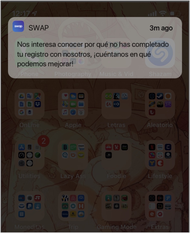
Push notification with a promo code (measure success and define if the cost should be added to de CPA)

Problem

B. We needed to know more about why the user didn’t continued the process.

Solution

Send a push notification which leads to a short survey about why they didn’t continue the journey.

Problem

C. The onboarding is not communicating correctly the features of the product.

Solution

Design different versions and address A/B testings to know which gets closer to our goals.

Problem

D. We have no idea which marketing campaigns are the more effective.

Solution

Measure marketing campaigns with Google Analytics and push the best ones over the others.

Onboarding Redesign

The problems we found were:


🤔

Too confusing

🖼

Little images, much text

💬

Not clear

👀

Incomplete (missing features)


Approach

I designed 5 different versions, and we validated each of them on an early stage vía:

  1. User Interviews
  2. Iterations
  3. A/B Testing


These were the different versions:


01. The Show Stealer


Characteristics:

7 screens

Tons of illustrations

Swipe between screens


02. The Condensed


Characteristics:

1 screen

5 features (with hidden content in a dropdown)

Little text and animations


03. The Oldie But Better


Characteristics:

5 screens

12 features (with hidden content in a dropdown)

More text

No animation


04. Short and Sweet


Characteristics:

1 screen

4 features

Icons and text


05. Not as Short


Characteristics:

3 screens

4 features

Each screen has its own illustration

Headline and 2 lines body text


Usability Testings

- As we were going to do a usability testing about these new onboarding versions (and each testing took little time) we decided to also test the current general flow (the one appeared afterwards a user created an account as this stage was the 2nd most important one only below the creating account one).


We were going to test two different flows:

a. Onboarding

b. General Flow (beginner)


Previously defined main flows

I named the main features “Swap Jewels 💎” as they were really important for the product and each of them had a different goal.


  1. Payments (bank account or debit card)
  2. Swap Keyboard
  3. Payment to cellphone number (vía SMS)
  4. Payment to email (vía web link)
  5. Swap Credit
  6. Customer Support


📝 The Thesting Structure

Number of candidates: 5

Interview length: 30-45 minutes

Previous knowledge about Swap: none (never used it before)


What we were going to review
  1. 3 of the 5 different onboardings (once a user went through 3 onboardings the context of the test loses unawareness)
  2. Each interview will start with one different in order to the first one to have no context at all
  3. General Flow (payments, add card, top up balance)


Time assignation

40% Onboarding (interactive prototype)

60% General flow (production)


📝 Interview Structure
Onboarding Interview

- Explain what is an onboarding

- Let the user go through the onboarding

- After the user went through the onboarding make the next questions:


  1. What was this onboarding about?
  2. What do you think is Swap?
  3. What can you make with Swap?
  4. Who can you send payments to?
  5. With what you are able to pay (where the money comes from)?
  6. What is the difference between Swap and a bank app?


General Flow Interview

- Let the user create a new account

- When the dashboard (home) is reached, give a few seconds to understand it

- Ask the following questions


  1. What do you think you can do here? List all the answers
  2. At this moment, what would you do first?
  3. How would you be able to top up your balance?
  4. If you have to send money to a telephone number, how would you do it?
  5. If you have to send money to bank account, how would you do it?
  6. How would withdraw your money to your bank account?
  7. How would you ask for money to a contact?

Android Only (because of interaction differences with iOS at development decision)
  1. How would you send your Swap CLABE number to a WhatsApp contact?
  2. How would you add money to your Swap Card?


🕵🏽‍♀️ Results:
Onboarding

- Improvements related with the different onboarding versions.

- A rank of the most effective one to the least.


General Flow

- It is interesting to test a production feature as you can always find bugs and insights besides improvements (always).


What to do with this information?

Bugs (things not working correctly):

  1. Measure how many users are getting them with defined events in Amplitude.
  2. Define the impact it is having for the business.
  3. Address them to QA for them to manage when and how are they going to be added to the roadmap.
  4. If it is a critical bug treat it as an urgency.


Improvements(things that worked but could do it better):
  1. Understand them and address the correct solution.
  2. Measure the impact of the change.
  3. Meet with the PM to add them to the roadmap.
  4. Frequently different OS present different bugs/improvements.
  5. A difference in usability between a OS and the prototype would fit as an improvement.


Insights:

- Interesting findings, such as: communication issues, user behavior, user fears, positive findings, user perceptions, etc.


Usabiliity Problems

- What we found that needed some sort of fixing.


Extras

- Fixes not directly related with the flow to be reviewed.

- Less relevant but also important to address.


🔮 To be continued... or not

This was the improvement of only 1 of the 5 stages, unfortunately the project went into pause mode because of reasons (priorities, they call it) 😢.