
 SCROLL UNTIL THE BOTTOM TO DISCOVER HOW SOME PIXEL BEAUTINESS
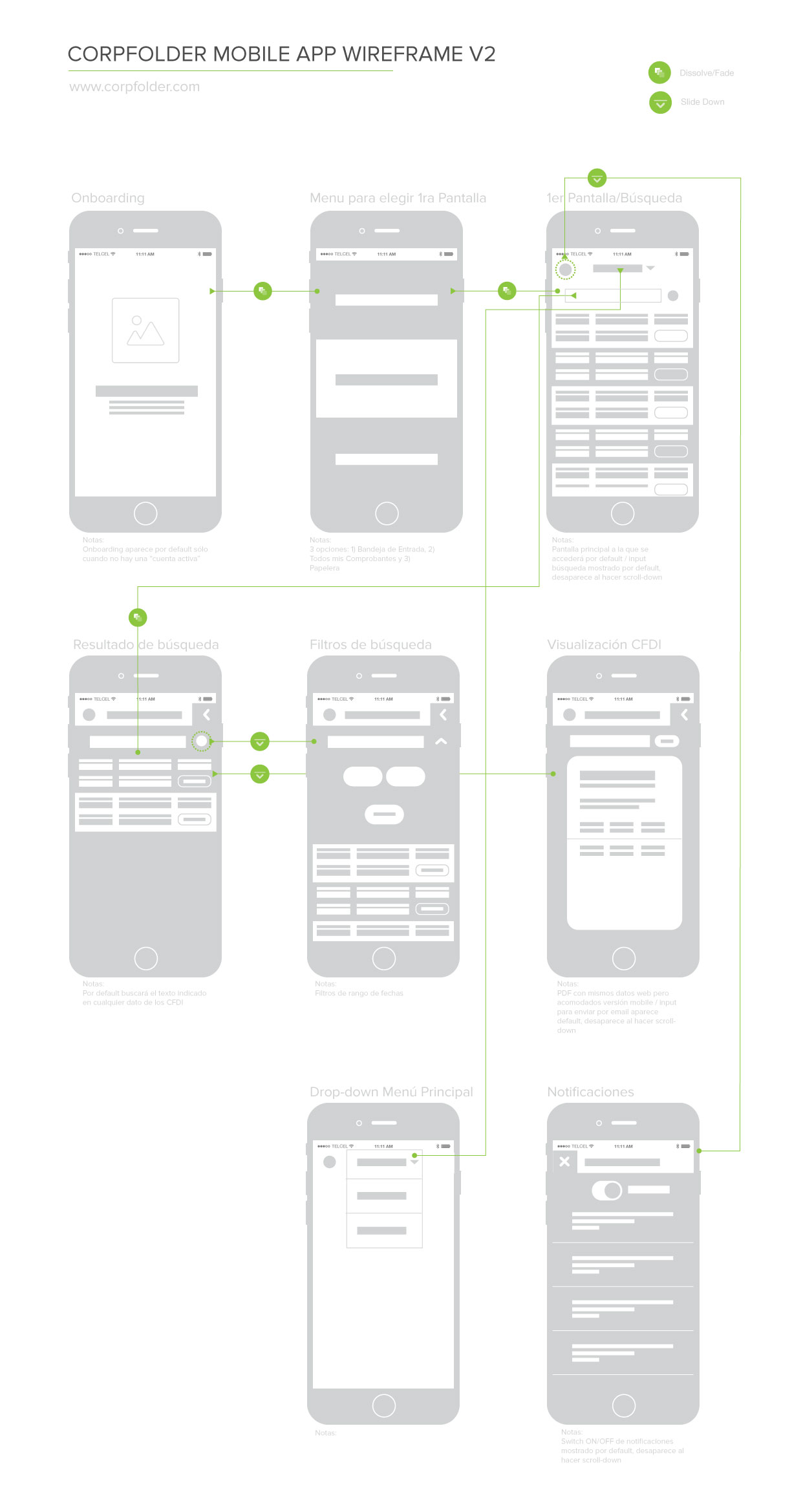
Corpfolder is a web platform which administrates the electronic accounting of more than 12K monthly active users.
Define the most important features to design the native mobile app.
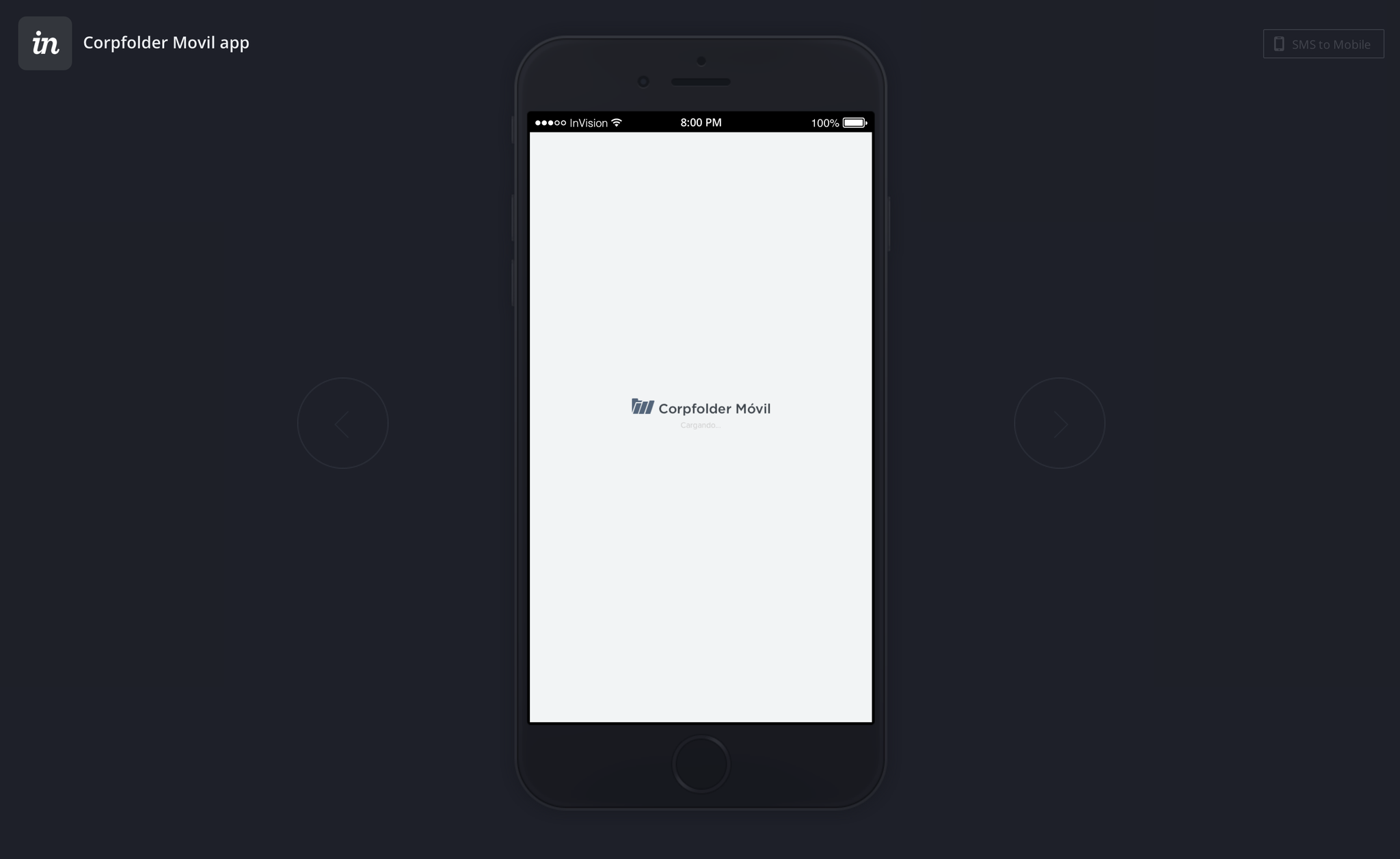
Try the prototype by clicking this image:
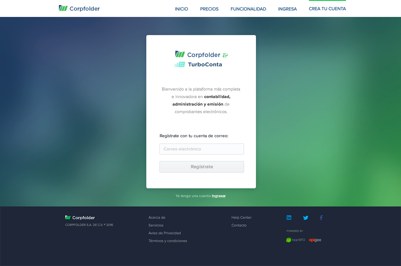
Design a tooltip/message to aware before creating an account so the user could choose between a generic or a personal e-mail account depending on his or the company future needs.
Here I came with various solutions, looking for the most accurate aiming for the look and feel of the platform and the UI library.
The idea was to have the prompt hidden and it only appeared whenever the user clicked on the input, looking for simplicity and showing only the relevant information always:
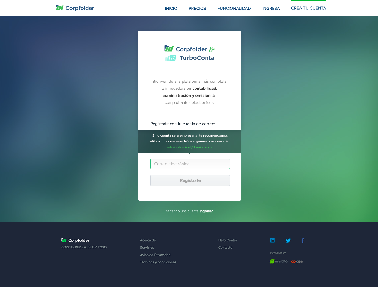
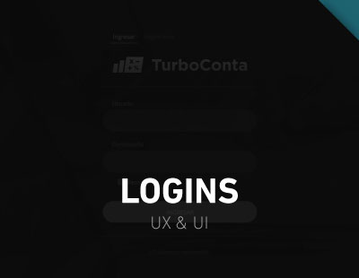
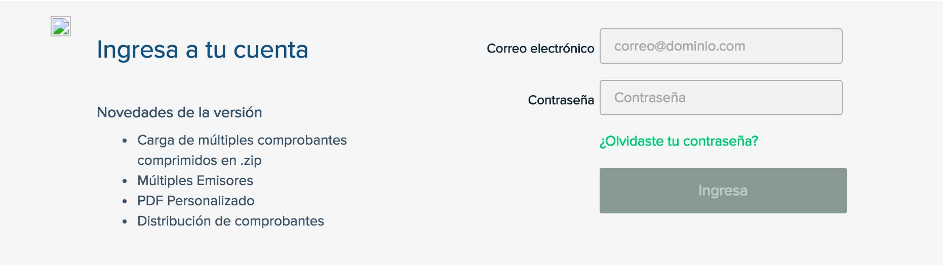
Redesign the login/signup in order to give the platform a more stylish style:
BEFORE:
- It was average, clumsy and not well organized
AFTER:
- The email input appeared selected as the login page loaded.
- The hierarchy of the information displayed was defined by color contrast.
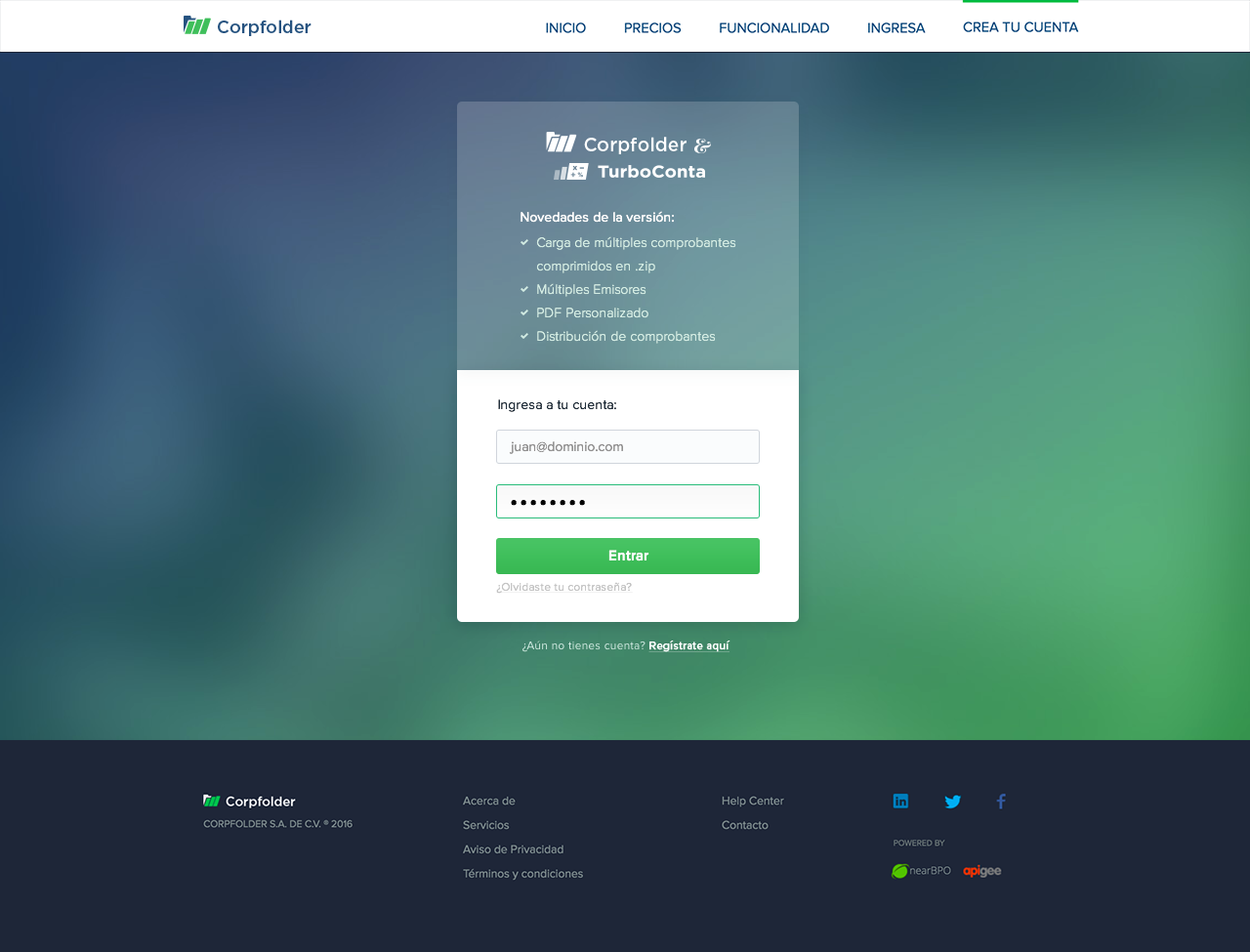
The users did a faster log in reducing the time of finding the inputs while avoiding distractions from 2.3sec. on average to 1.5sec