😅

Size matters!

Please don’t review my portfolio on this small screen, as it is not yet developed to manage responsiveness, he.


Here, have a burrito 🌯 for your journey thorough your desktop.

Why where our users not using us?

We had a flawless platform and such a nice UI, so what was happening?

I'm always asking myself questions about everything. So, when I joined a product that had been stuck in a growth rut for a while, I knew I had to dig deep to figure out what was really going on.

My role Platforms
. Growth Web App
¡ Product Designer

Problem Statement

Why were our users not using us?


No Plan of Action

I began asking questions to anyone and everyone who had any knowledge about the product: sales reps, developers, operations team—basically anyone who had ever been involved with the product.


Before diving into the world of product design, I worked as an Art Director in advertising and had picked up a ton about marketing along the way. This prior experience really came in handy for understanding the bigger picture of the product and the business it aimed to build.


I broke down my research into two parts:


💼

Marketing related

🕵🏽

User Research

Research

Conducted several 1:1 interviews with stakeholders, heavy users, and drop out users.


Every time I found something new, it just raised more questions, sending me back to square one until I could really pin down what was going on.


Findings

Conducted several 1:1 interviews with stakeholders, heavy users, and drop out users.


Every time I found something new, it just raised more questions, sending me back to square one until I could really pin down what was going on."


1.

Lead the Understanding and Tasks Definition.

2.

Not everyone needed all features.

3.

We were getting 5 new users per month.

4.

3% of new accounts where actual users.

5.

95% of new users where missing the set up.

6.

A user would generate 20 invoices per month.

7.

CHURN was at top peak.

8.

Ads where only generating ‘likes’.

9.

Users needed to register TaxID to generate invoices.

10.

The LTV of a user was really low.


After this extenuate research I created 5 main problems to solve:


🐢

No plan of action about how to get customers.

❓

Missing product market fit.

⏲️

Missing answers for CPA, LTV, CTR and other key metrics.

😔

Users where not setting up their account.

👷🏽‍♂️

Current MKT campaign was for ‘maintenance’.


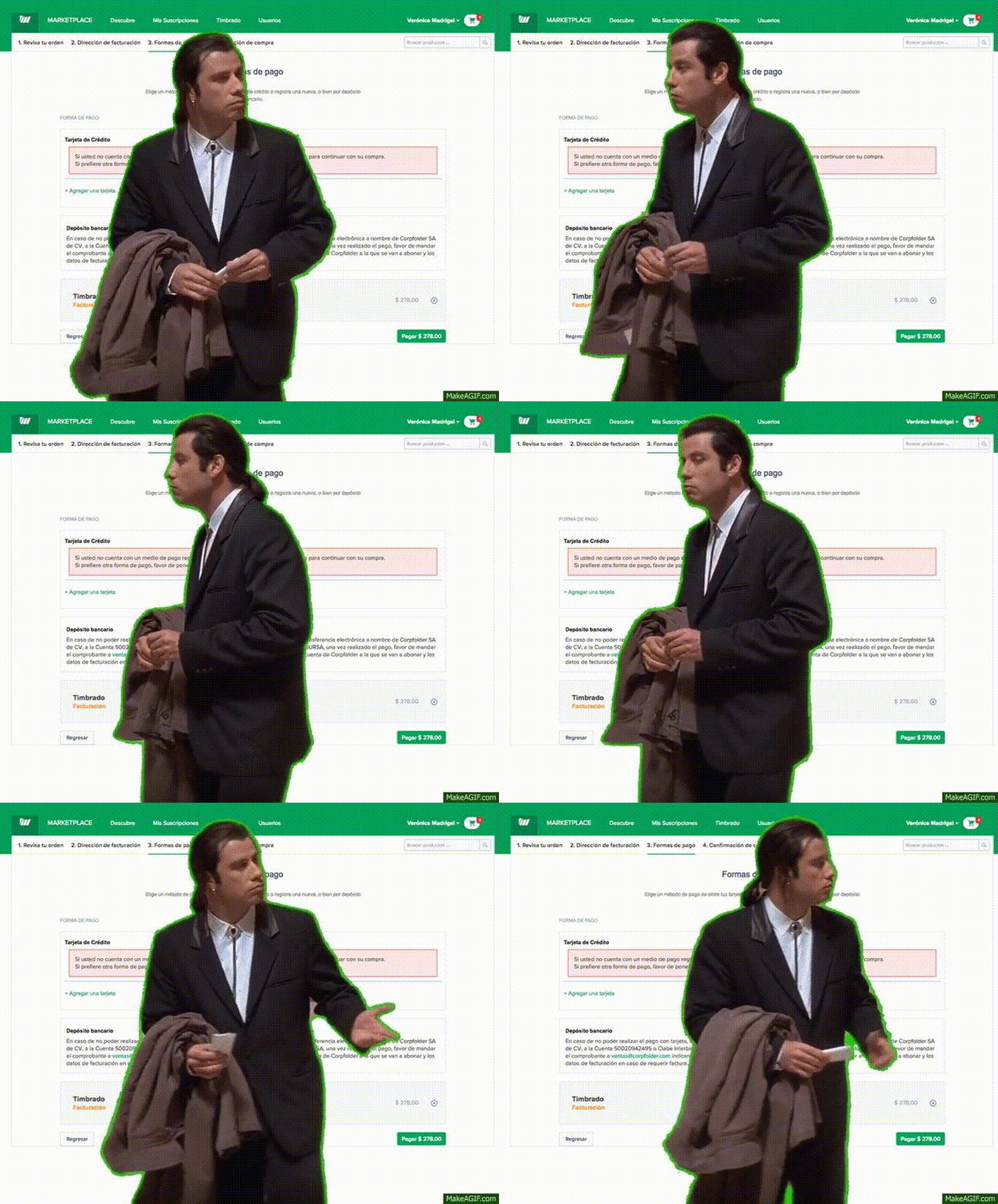
Basically, this GIF would sum up everything that was happening when a user created its account:

Everybody is asking: so what exactly is Corpfolder?


Let me share a video with you that I wrote, created the script for, designed the art, and collaborated closely with the animator to bring it to life. It's in Spanish, but subtitles are available. I also didn't want this work to go unnoticed, so that's another reason why I'm sharing it here:


What I designed for Marketing

I wanted to lead everything related with marketing leveraging with sales people. We were a tiny team so that is why I wanted to add this role to my responsabilities.


Before, there was someone in a marketing role, but they didn't accomplish much and ended up getting let go due to poor performance. My hunch is that the person who hired them didn't realize that what we really needed was someone with experience in startup growth. The product wasn't gaining any traction, so we needed more of a growth strategy rather than a traditional marketing campaign, which would've required a big budget—and that was also something we were short on."

I started by creating an AARRR funnel


After this I started mentioning the lack of definitions

We weren’t able to answer the next questions:

  1. How much does it cost a single user? (CPA)
  2. For how long does a user use the platform?
  3. How much does a user spends in its lifetime (LTV)
  4. How many leads saw our ads vs. how many do we convert? (CTR)
  5. Which ones were the channels we were currently converting users and how much we were investing in each of them?


  6. And more questions regarding the individual channels used to generate leads.

All current strategies were incomplete and were achieving nothing

We weren’t able to answer the next questions:

  1. How much does it cost a single user? (CPA)
  2. For how long does a user use the platform?
  3. How much does a user spends in its lifetime (LTV)

Digital Marketing Campaigns


  1. Previous campaigns where leading only to a HOME webpage and nothing else.
  2. Nobody measured how many conversions were being generated.
  3. Previous data were only ‘vanity metrics’ as they achieved nothing except saying thinks like: “we got 3,000 clicks”, and that’s it. Nobody took a little bit of time about asking what happened with those 3K clicks after happening.

My Strategy


  1. I defined 6 different channels to get customers.
  2. Created the KPIs to measure the success of each one.
  3. Defined a general budget to invest in this campaign.
  4. Divided the budget into each channel depending on the effectiveness that we expected to happen.

However...


and this one was going to be a HUGE detail.


NOTHING of this fancy ideas would work if the product wasn’t ‘fixed’.


The main problem was that the users weren’t able to understand what to do once they created their account.


And because of this I wanted to create an... 🥁 *drums rolling* ONBOARDING.


The Design of an Onboarding


The actual state


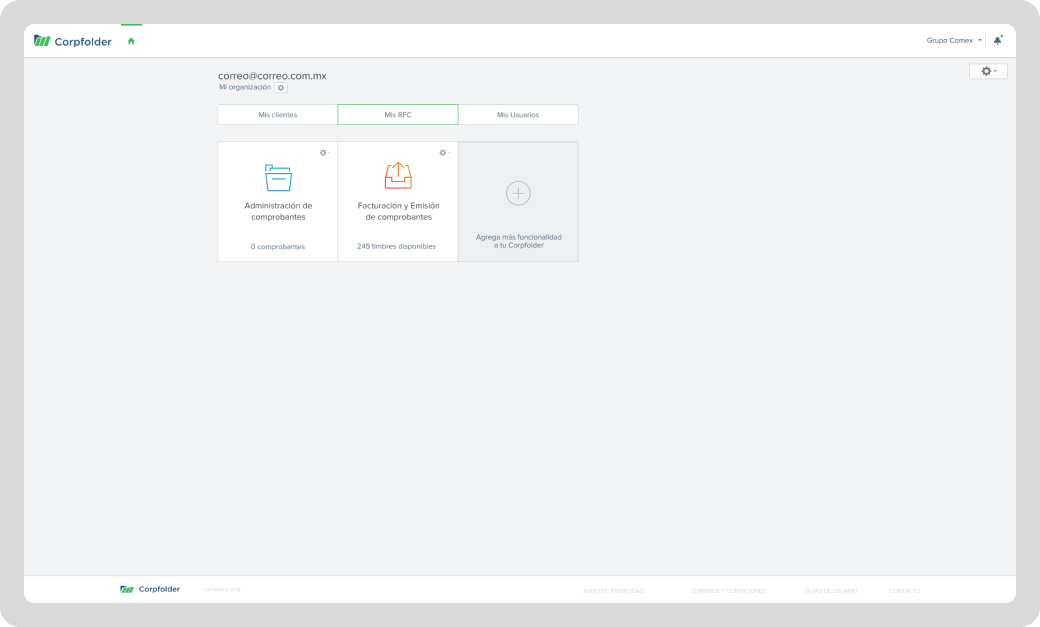
Whenever the user created an account they would see this screen and nothing else:


Next steps


From the findings and previous research I needed to have the next crucial details in mind:


1.

I needed to combine the “set up” with the learning of the platform.

2.

Broke down the onboarding in digestible chunks with sub tasks to make it easier.

3.

Visual cues will be permanent until the user accomplished it.

4.

Broke down the onboarding in digestible chunks with sub tasks to accomplish it.

In the 1st part, users would also need to set up a company with a Tax ID (RFC), add a user to send invoices, and create other users for additional account management if needed.


All this information was readily available to the user, as it's required to generate any type of invoice on any platform.


Generate an Invoice


In this part the user would learn how to use the platform by generating its 1st invoice.

Administrate Invoices


Here, the user would be able to take a quick tour to understand what to do with generated and received invoices.

And the last step: Marketplace


This was the place where the user would be able to get other apps (features) and the invoice tickets.

Some improvements on the go


"As you saw on the first screen, we had a really simple dashboard that only showed how many invoice tickets the user had left and how many invoices the system synced with the official platform.


So, I wanted to enhance it with the knowledge I had gathered, and that's exactly what I did.


1.

Invoices graph in the dashboard with critical data

2.

Income / Expenses amounts

3.

Define time period to display and compare with other period

4.

Income, invoices and pending payents tabs.


Previous


Redefining the P2P Payments

You reached the end of it


Back to Home, baby!