Redefining the Product Core Benefit

Redefining the P2P payments

Swap was born before wire-transfer payments were a thing. At this moment making a payment to another bank was a huge pain point and needed to be addressed.


6 years later everyone had this feature, there was the need to redefine why the users would stay with us.

My role Platforms
Product Manager
· Product Understanding
· User Discovery
· Data research
· Features Prioritization
Product Designer
· Visual Design
· Interaction Design
· Usabilily Testings and iterations

How

Exploiting the user need of making payments to anyone and make it delightfully easy. Easier than anyone else.


With the competition arising and improving their payment capability. It was a matter of time for Swap to take decisions to stay relevant (at this point any other bank and P2P payment app did the same as Swap).


The Challenge

Come up with a way to keep Swap relevant for our users and stay ahead of our segment.


The solution was within our core feature all the time.


— Persuade Swap users to make every payment with Swap.

Approach

🤔

Swap was already the easiest way for making payments, but: could it be improved?

💫

Our north star was the right one ("Payments made easy") or needed to be questioned?

What would it be the main metric to measure that we were heading to our goal?

Understanding

1. First of all we needed to review the actual user experience with the mayor competitors. This was done with users of each competitor app. The main goal here was to understand the user journey and define existing pain points.


2. Also we reviewed our own users with quantitative research; starting with some fancy customer discover interviews. An hypothesis related with the actual complexity of payments and with finding ways to make it easier was defined previously.


Ideation

1. The payments flow were already in an improvement stage (link). The opportunity of improvement was found in making payments (either with a new transaction or with the Swap Mastercard Debit Card.


2. An Ideation Workshop was conducted with the stakeholders. The result guided us to explore how would we persuade Swap users to pay for anything always; going beyond "We can make the ask for money experience as easy as doing a payment" (flow that was already at an improving stage).


3. By going backwards in the payment process we discovered no competitor was working on an approach to make something about "owed money".

Discoveries

– We found 1 of each 10 payments a user did were "social".


– We launched a Swap Debit Card and, until now, it had the same mechanics as any other debit card. This was the opportunity to have a differenciator.


— Swap will become not only the easiest way to pay but also the easiest way to collect money. Therefore: “Swap users would want to pay for everything, always”.

Payment Stages

1.

Making a payment.

2.

Contextualizing the payment

(was the user close to other Swap users, was the payment made on certain type of business, etc).

3.

Payment receipt.

Show Off

We designed a way to automate (as far as tech capability let us) the "money collection" (fancy way to say: "pay me back my money please!").


The process would be as simple as:

  1. Swap user pays.
  2. Payment Context (the understanding of what happened around the payer).
  3. Automate how the user would ask for money.
  4. Use already implemented features (it saved us tons of development time and also these features fitted nearly perfectly).

🤖 Automate the Check


Whenever a Swap user did a payment with the Swap debit card, this happened:


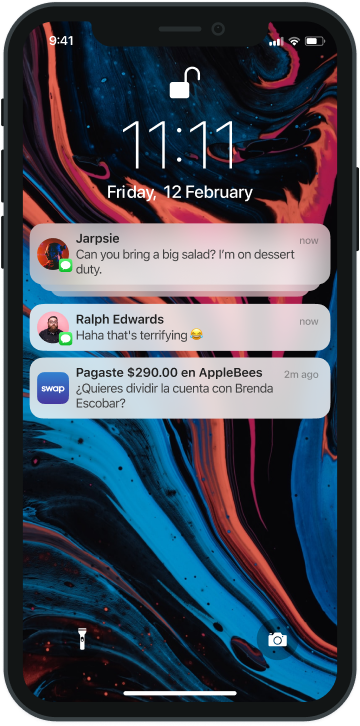
1. If you were near a Swap user (that you knew; that were added as a friend or contact) a prompt as a notification would appear saying:


"Would you like to divide this payment with [nearby user]."

Being literally 1 tap away from a 50-50 automatic split..


🔍 1 of 10 payments done with the Swap debit card were socially qualified (within the context of wanting to split the payment with a nearby contact).

After you tapped the notification this would happen:


a. Inside the app you would be able to select whith whom you want to share this payment.


b. Appearing on top the closest (phisically) users (added previously by the payer).


🔍 Users without Swap were also elegible to be notified as the app already had an SMS feature.

– An invitation to sign up and pay would be sent to a non-Swap-user.

2. If you missed this prompt you could recall it in the TX ticket (payments history) inside the app.


3. If you did an online payment you would be able to divide it as well.


— Any type of payment you did were able to be splitted with anyone!

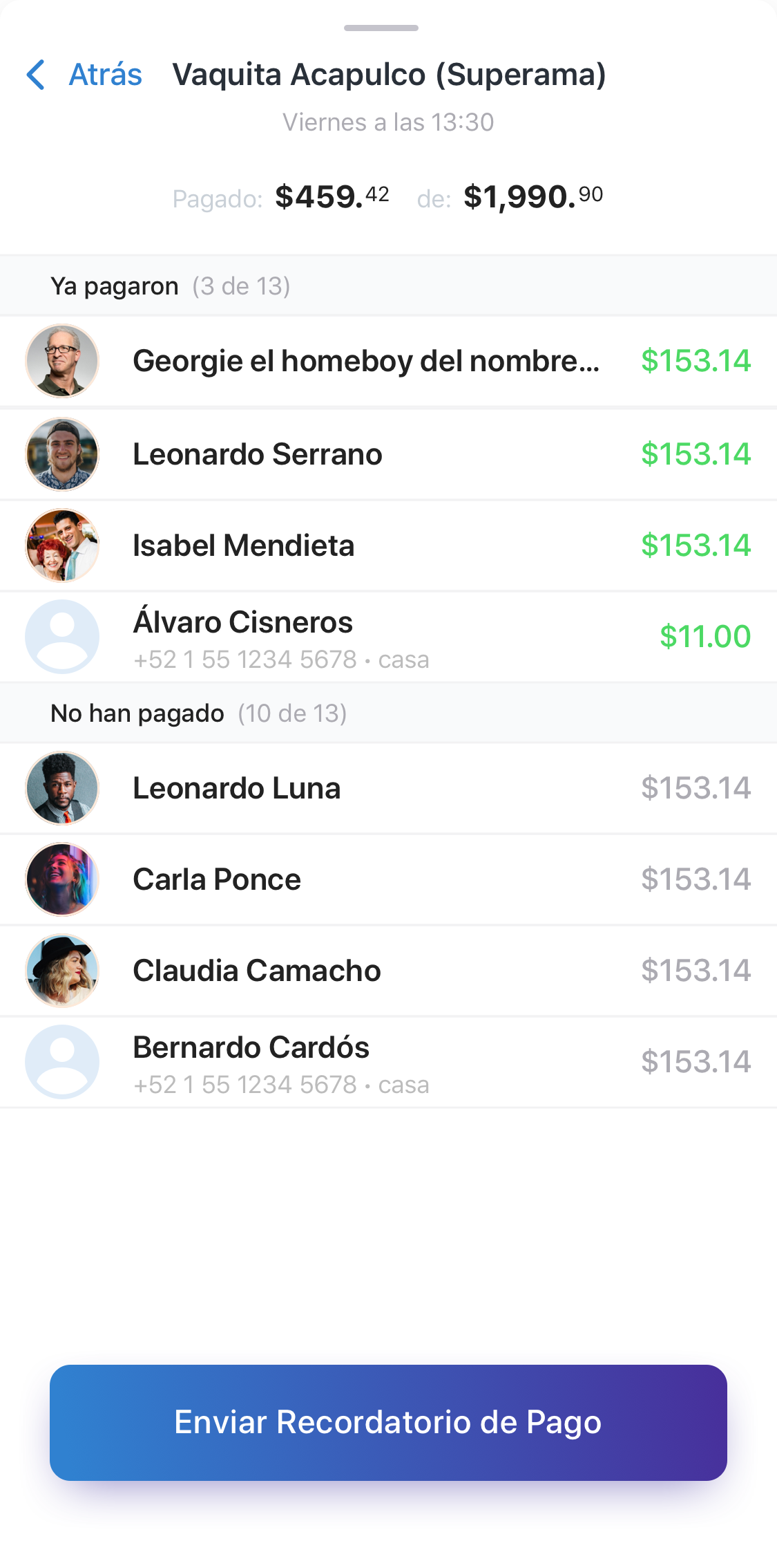
4. Whenever a charge was created automatically a record of the payers would be delivered in the ticket of this transaction.


This will containt the payment status: payed, pending, etc. The specific amounts and the option to send a friendly reminder. (no broken legs, I swear).


5. Swap already had a method of sending SMS with specific content so this feature was used.

📗 Assessment

How does success is going to be measured? We came up with the following metrics to have an eye on after releasing the feature:


  1. Number of users using the feature. (total and monthly grow)
  2. Number of users inviting other Swap users to use the feature (vía adding them to their payments).
  3. Number of non-Swap-users signing up through a Swap link (vía refferal SMS).