😅

Size matters!

Please don’t review my portfolio on this small screen, as it is not yet developed to manage responsiveness, he.


Here, have a burrito 🌯 for your journey thorough your desktop.

From have to, to want to

How a compliance task became an opportunity to improve the whole product

Swap had to meet certain tasks in order to be regulated by the CNBV (the institution who issued the licenses to all the mexican fintechs), many of them related with the payment process. These needs were mandatory (but kept certain room for interpretation, and therefore, to do some magic 🪄).


This is how a simple task list had the opportunity to become something more interesting for the business and the users.


The compliance was related with several changes in the payments flow and, therefore, this was the opportunity to review the process in order to improve it.

My role Platforms
Product Manager
· User Discovery
· Stakeholders Input
· Roadmap Definition
· User Stories Definition
· Features Prioritization
Product Designer
· User Interviews
· Journey Mapping
· Sketching
· Wirefrwaming
· Screen Flows
· Visual Design
· Interaction Design

Background

SPEI: the engine that processes all the wire transfers in Mexico, the only and almighty one.


Since the beginning of times using SPEI to do payments between different banks has been an awful experience, some hard numbers that showed up in the benchmark:


TIME IT TOOK TO DO A SINGLE PAYMENT (less is better)


1) BANORTE: Mainly because of the “need” to register the bank account (a process which took 30 minutes to update). All the other banks got rid, somehow, of this “feature” at least one year ago.


2) BBVA: The main issue was copying manually de CLABE number between apps because, at least in iOS, there wasn’t a way to copy/pasting it, incredible right? It was an input without the basic attributes of an input. Like when an input to write down 6 numbers appears but the keyboard popping up is a regular QWERTY one instead a number pad.


This benchmark was done somewhere half of 2019, hopefully the average time had changed.

The Challenge

I was looking to improve the payment experience to outstand from all the competition and become a facilitator of a very difficult process (well, if you have to pay it is always difficult to say goodbye to your well earned cash).

The main reason of these improvement was to become a differentiator with the most used feature.


95% of the user interactions with Swap were related with payments, directly or indireclty. —

We expected the user to be quite comfortable with the payment process and become the number one alternative vs. other major banks (yes, the ones mentioned before in the benchmark).


But wait: how are we going to become the number one payment possibility if the users had plenty other banks? Well, that was easy taking advantage of one of the mains features of Swap: being a wallet.

My Role

When this improvement started I was working as a Product Manager + Product Designer (yeah, it was a lot of work but I wanted to taste the beautyness of both worlds). It was a solo adventure; I was the only designer involved).


I worked alongside the main stakeholders, these being: marketing (also a combination between marketing and data analyst), the CEO and the developers (the all mighty techie guys as we call them), the client support manager and also once in a while a chat with legal was necessary as there are always doubts about what you can and can’t say in this well regulated industry (I mention this last one because plenty of fintechs had been fined with good amounts of money: up to $9M MXN) just because one single word was used wrongly, so extra precaution has been implemented since then.

Design Process

The first approach I took was having a meet with my number’s master (which is my marketing/data science manager) to review the funnel and get some general insights about the process.


The manager of the Support team was key as they have a top 10 most received issues, plenty of them were related, directly or indirectly, with payments.


Also it was the opportunity to review my good ol’ improvements annotations notebook. This one contains several improvements talked here and there with random meets, chats, emails, thoughts, workshops, etc. with every member of the team since I started at Swap.


Next step was doing some field tests with heavy Swap users to obtain ‘real world’ insights.


Discoveries:

🕹

Swap implements 'levels' to limit payments to prevent frauds.

⚙️

Hiring a 3rd party API to manage the payments acceptance rate.

🎛

Banks use dynamic CVV, unlike SWAP, which uses static CVV.

💸

Users usually repeat the payments to the same person.

🚀

Users stayed at level 1 as they didn't remembered they were able to upgrade.

🤔

Some users didn't know what to do after the account was created.

Deeper Insights

How we were going to measure success?


Definition Metric
1. Successful Payments Number of drop outs
2. Failed payments Number of failed payments
3. Support contact regarding payments issues Less payments topics
4. Saved payment receiver vs. new transactions (from scratch) TXs comparision
5. Shortcuts payments vs. New Payments TXs comparision


— At this moment, around 5% of monthly transactions failed. This failures were the main reason for a user to stop using Swap. —


The main reasons payments failed were:

  1. SPEI failure: Random dead times causing delays in transactions.
  2. Transaction limit reach (defined by the level of the user).
  3. The origin of the funds (credit or debit card) were rejected by their banks (mostly because of not using a digital card for a digital transaction).

Reframing the Problem

As the project got more complex, we had the need to redefine what we wanted to accomplish:


— Create the fastest and easiest payment of them all. —

This is how:

  1. Whenever a user entered Swap we announced a possible delay because of one of our providers (SPEI), not only blaming them but making clear what where going to happen with their payments, assuming the responsibility.
  2. About the user limits why had 2 quite different solutions:
  3. 1. Implementing a way to validate each of our transactions.
    2. Separating the transactions in two different types, depending on the origin of the funds: balance and credit/debit cards. So we let the user able to move any amount of money directly from their balance (this also helped the business as we saved tons of money in transaction fees).
  4. Implement a dynamic CVV interface to let the user write it in (this solution brought to life new problems like why a user would open its bank app everytime they did a payment, but for now it was enough. This is a good example of versioning and how a solution kept the need of being assessed and got a fancy place in the backlog).

The Payment Redesign

The original user journey for a payment was:


*There wasn't a way to create frequent contacts (although it was the 2nd more frequent transaction type, only behind new transaction).


The proposed journey merged both worlds: new transaction and new frequent contact.


Contextually:

– 95% of the time a user had the need to add a frequent user were in the flow of creating a new payment for this same user.


The journey evolved to:


Results:

The total number of steps decreased by 40% but time, the real metric here, was reduced by 45%.


Swap aginst the #1 bank in Mexico:


These were all the improvements:

01. Instantly for the
Frequent

Send money to anyone with only 1 tap!

Swap Users

Cards

Wire Transfer

Email or telephone

Time reduced by

60%

Steps reduced by

60%

1 of 7

Recurrent

What is it?

Top recurrent payments as a shortcut in the main dashbaord (either if they were Swap users, credit/debit cards or CLABE numbers).


Basis

Payments was the main action a user did (95% of interactions were payments), heavy users (the beloved ones by Swap) did frequent payments to the same user (up to 7 per month) and they had to do each of them from scratch (there was no way of saving a user nor to re do payments).

Metrics Used

01. CSAT (Customer Satisfaction Score)


Doing recurrent payments from scratch was the main friction for a heavy user doing up to 4-7 payments to the same user per month and it affected the whole user flow.

BEFORE

3.5

AFTER

4.2

DIFFERENCE

+.07

%

+20%

02. User Actions per Session


Reducing them where a major KPI as the number of user journey steps decreased considerably.

BEFORE

15

AFTER

9.5

DIFFERENCE

-5.5

%

-36%

03. Session Duration


As we shortened the steps to complete the task, the total session duration would validate the time reduction.

BEFORE

2:30m

AFTER

1:28m

DIFFERENCE

-1:02m

%

-41%

04. Bounce Rate


Being a failed payment the main reason why a user stop using made this metric an essential to measure.

BEFORE

15

AFTER

12

DIFFERENCE

-3%

%

-20%

02. Instant Re-Send

Having thumbnails for an instant recognition was a game changer in a simple test for a user to find specific previous payments.

x3

Faster recognition

These thumbnails were defined by the user which boosted the speed of recognition by x3 times.

80%

More recognizable

The speed of finding an specific contact (previously added by them) was 80% faster than just by reading the name of them.

What is it?

In the history of transactions, while consulting a specific previous payment (ticket) a ‘re do’ button will appear to create a new identical transaction, considering the chance of changing the money amount to be payed.


Basis

The main reasons why a user reviewed the transaction history was:

95% checked the status of a previous payment (sending txs), this action also contemplates the screenshot to share with their contacts about the payment they did.


The remaining 5%:

45% of users reviewed the amount which was sent.

40% of users reviewed the date.

15% of users reviewed to resend the transaction information.


The user had an specific behavior of reviewing its transaction history to find less frequent payments (once per month). This insights stated the need of a quick access path from the transactions section.

Metrics Used

01. 'Redo' vs. Start from scratch


75% of the previously mentioned users which did a review with the objective of replicate the payment went straight to the 're do' button instead of starting a payment from scratch.


Here we found an improvement added to the roadmap: how to push the feature with the remaining 25% of users.

BEFORE

0

AFTER

75%

DIFFERENCE

+75%

%

+75%

03. Handy Review

Although the access to the Transactions History was located at the main bottom nav, contextually, it was needed here as well.

🤓

This feature never was realesed, therefore, the metric to know how % of users accessed from this shortcut or the main nav wasn’t implemented.

What is it?

In the main dashboard it would appear a short version of this ‘txs history’ as consulting a transaction is the 2nd most used feature.


Basis

Reviewing the last 10 transactions done (either the status of them, the amount, if it was received or sent, the date or the type) was a constant in all the users who didn't opened the app to do a payment.

04. New Receiver On The Go

This process felt (for the users), by far, easier to complete than the one in the main competition bank BBVA.

As mentioned before, having a thumbnail defined by the user boosted by x8 times the speed of searching for a specific benefitiary.

What is it?

Creating a new money receiver:

I. Built within the ‘new payment’ flow, this would tackle 2 birds with one shot:

a) The regulation needed the full name of the beneficiary.

b) The option to add a new payment destinatary.


II. This flow could also be accessed straight from the ‘new payment’ screen.


Basis

- Saving a destinatary is not mandatory as a user can skip this step, this would work for one time payments (on average: 70% of all payments were one time payments).


- Contextually the user added this new destinatary whenever it needed to do a payment.

Metrics Used

01. Previously there wasn't a way to define if a user wanted to save a destinatary. Nor a way to edit them (change names, thumnail, sensitive information, such as; card or CLABE number).


The main metric was doing a payment from a previously saved destinatary vs. doing a payment from scratch to this same destinatary. The only users who did a payment from scratch were the ones too lazy to search for the destinatary (yes, this 'search' feature was contemplated for a next version).

05. Straight from the Clipboard

-40%

Actions per session

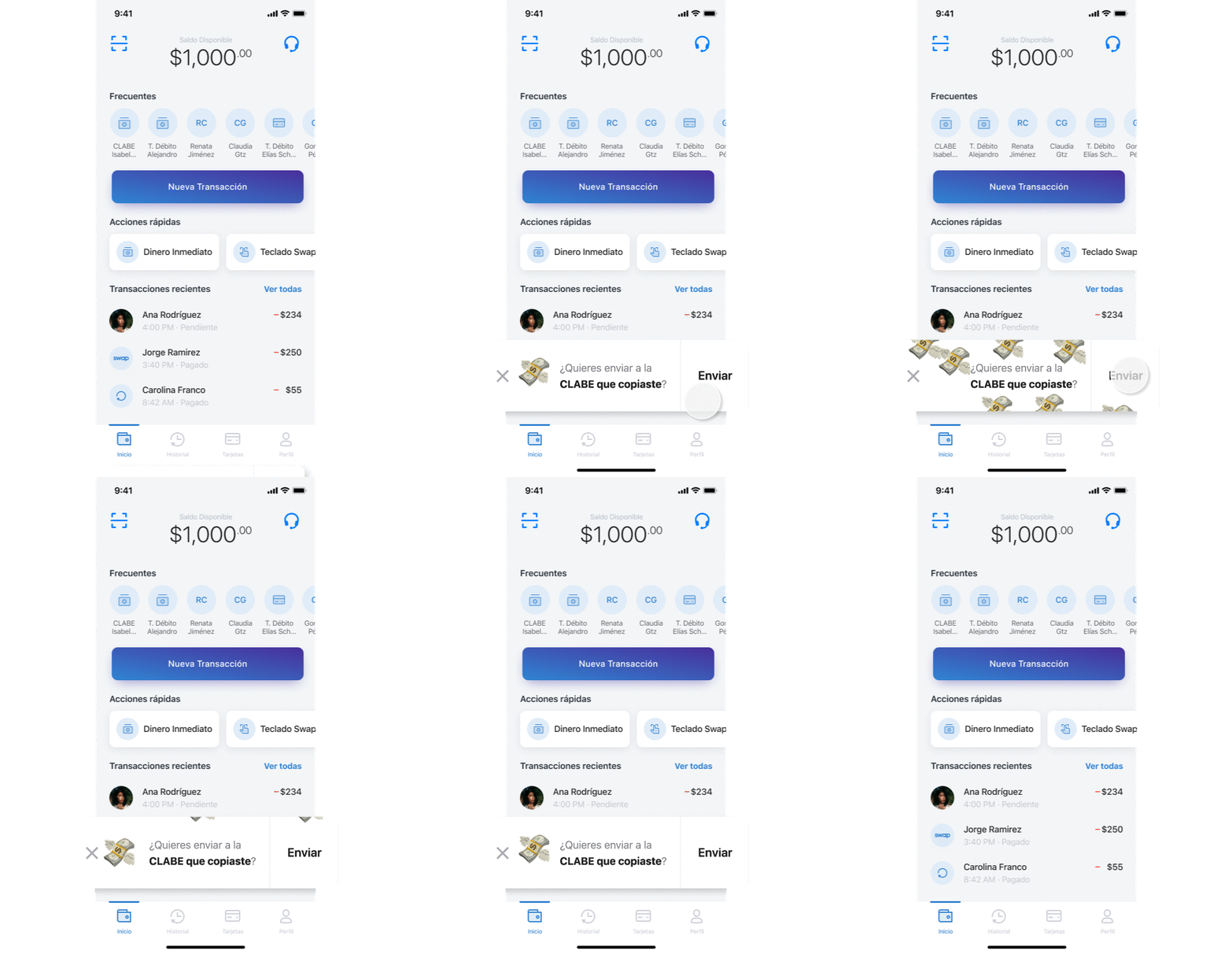
This was one of the most successful improvements to day. It impacted in the whole app as it reduced almost 40% of the user actions per session (in this specific task).

x5

Times faster

The payment flow was 5 times faster than the one in the leader bank app: BBVA.

What is it?

Whenever the user arrived to Swap with a credit/debit card or CLABE number in the clipboard a shortcut would pop out to let the user send money to this destinatary instantly.


Basis

As 'doing a payment' was the most used feature a heavy number of users (almost 60%) arrived with a credit/debit card or CLABE number in their clipboard. As this number is needed to define where the user wants to send the money.


📝 V2 – For a next release we wanted to add the feature (using the already implemented card reader) to get a card number or clave straight from an image (weirdly there is, approximately a 20:1 ratio, a lot of users who share a picture of their bank account instead of the number as plain text).

Metrics Used

01. One tap payment (clipbaord) vs. new payment (from scratch).


ONE TAP PAYMENT

+68%

ACTIONS PER SESSION

-40%

06. Top Up - How To

🥇

Boost users

The main objective we wanted to reach with this improvement was .

🎯

Error proof

As the user needed to tap (for it to dissappear) the visual cue to learn what was able to do there was no problem for the user to know how to do it later (2-3 weeks later).

What is it?

In order to top up the user’s balance a simple click to the balance will be enough to show the different options available.

- For new users, as this interaction has no visual cues or previous interaction knowledge, a micro tutorial was mandatory to discover it.

- As a second option a CTA to ‘top up’ will appear next to the balance.


Basis

We had a button ('top up') we needed to get rid of in order to give space for a QR feature.

The 'top up' action was moved straight to the balance (as it was merely informative) and made it interactive, givin whithin a context.

Metrics Used

01. A/B Testing

We put a lot of attention to possible misleadings. But with the tutorial added and a tooltip apearing util the user did the flow at least 3 times it was error proof.


% USERS OLD

12%

% USERS NEW

16%

CHANGE

+4%

07. Upgrade

💡

Boost users

Previous this improvement users only were notified to upgrade 1 time (as they created their account) and nothing more after all.

🎯

Error proof

As the user needed to tap (for it to dissappear) the visual cue to learn what was able to do there was no problem for the user to know how to do it later (2-3 weeks later).

What is it?

The main notification (primarily to get the main attention in the dashboard), was redesigned to achieve this need of being above everything else. Mostly used for promotions or temporal announces related with the user’s account.


Basis

There weren't any previous fixed notifications in the app.


Users needed to compelte the KYC and going through a 'upgrade' in order to get the best from the app (without it the users would be able to use less than 20% of the features and this stage felt like an error).


Because of this we added a fixed alert that we gladly called 'christmas tree' (as it resembled a 🎄 with lights and beautiness among regular trees at night, jeje. Lovely metaphor, right?)wich outstanded and invited the user to complete its KYC while showing the benefits of doing it.

Metrics Used

01. A/B Testing

We managed this one as an A/B testing comparing it with the previous way of doing it.


% USERS OLD

16%

% USERS NEW

37%

CHANGE

+21%