Please don’t review my portfolio on this small screen, as it is not yet developed to manage responsiveness, he.
Here, have a burrito 🌯 for your journey thorough your desktop.
My first mobile app!
My boy Pedro, a kind of gambler, had an interesting idea that got my attention right away; he started talking about his compulsive obsession with sport bets and how much money he made (and also lost) by following a few tipsters via X (formerly Twitter). He explained me the lack of organization of these so called tipsters and how we could create a solution for them to manage everything in automatic mode.
To be frank, I do not like sports at all and the only bets I’ve done in my life was purchasing a shitload of $GME and $TSLA in mid 2021 (good times), but none the less it seemed an interesting product and I was ready to invest tons of thinking to be able to deliver and make tons of money as well (spoiler about being millionaire: it hasn't happened, at least not yet). In resume: this was really challenging.
My role | Platforms |
---|---|
Product Manager | |
· User Stories | |
· Prioritization | |
· Sprints and Roadmap Definition | |
· Goals and User Stories Definition | |
· Features Prioritization | |
Product Designer | |
· Critial Thinking | |
· Journey Mapping | |
· Sketching | |
· Wirefrwaming | |
· Visual Design (UI from scratch) | |
· Emoji Embedder |
Tipster: the person that predicts sport matches results and creates bets.
Tip or prediction: the prediction (there are several different types of bets).
1. Create a platform where tipsters would be able to create different tips 2. to let their followers know them in chronological order and define the streak of previous bets.
I had to learn from scratch how everything worked; the sports, the bets and the sport bets predictions. It was such an interesting knowledge as it had tons of structure.
I had to design complex situations and make them as clear as possible for our final users, the good news: all of the final users had a good understanding of each of the context and the words we were using.
As the team where only 3 persons (1 business, 1 dev and 1 designer (me)) I had to take the roll of Product Manager + Product Designer.
I worked alongside the stakeholders as everyone always have different information and expectations. This is how I will be able to define the different checkpoints that I will happen in order to keep everyone up to date about what we are doing, why and, most important: the goal we want to achieve.
The first approach I took was having a seat and learn everything from the pro, I had to go through a lot of information, examples and actual solutions (almost all of them implied WhatsApp groups).
We had different sports, and bets. We needed to show all of them in a simple way.
We needed to define the hierarchy of each sport and bets to have order.
Bets had different states and we needed to define them as well.
Tipsters shared more than predictions, we needed a place for a conversation.
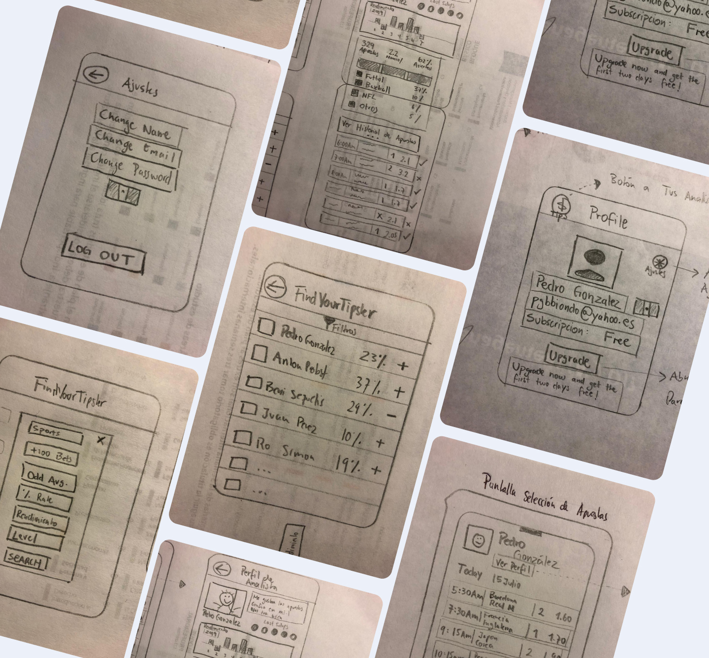
From here, we knew what we needed to show/have and the next step was to define the user flow.
Also a little bit of branding was involved, like the name of the app and the logo:
We needed 2 user flows:
a. CUSTOMER FACING: the general users, the ones that will consult the bets predictions created by the tipsters.
Attention to detail
Here I will showcase the mayor challenges regarding UX and UI of this specific user flow:
Components
When was the match scheduled to occur
Always were 2 teams involved
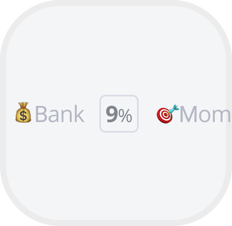
Which percentage should be betted
Specific name
Increaste if successful
Exploration #1
We had the basics, we needed to display:
Exploration #2
We realized we’ve missing several information, so we added:
Exploration #3
We realized we’ve missing several information, so we added:
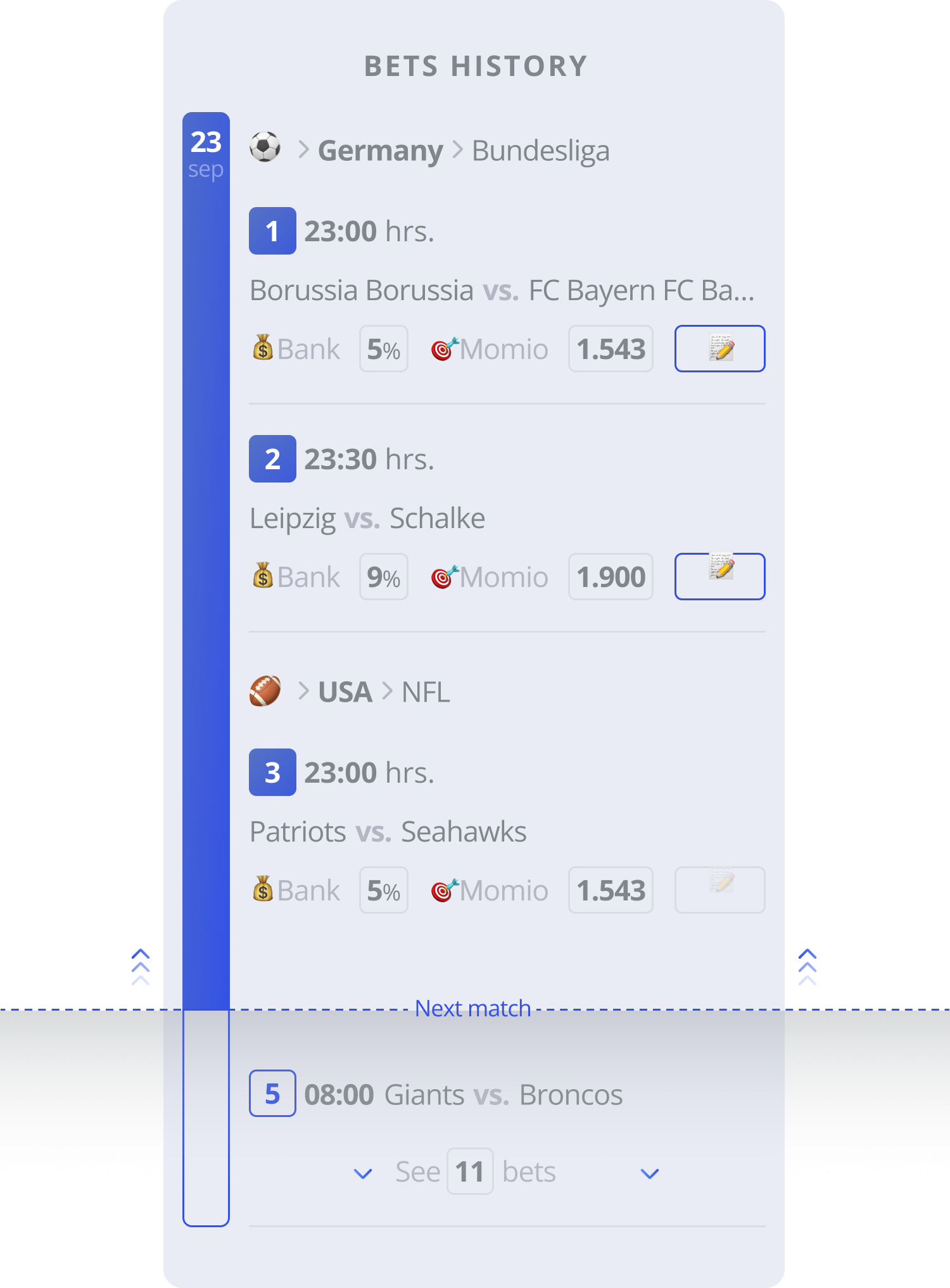
Mixing matches with simple and complex bets.
As the day would go by matches would happen as well, so 'same-day past matches' had to be differentiated.
Emojis love!
Exploration #4
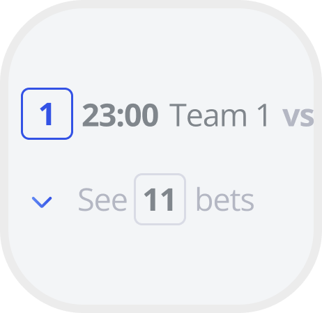
Let’s display a shitload of different type of bets. You know, what happens when the user clicks on ‘See Bets”.
Exploration #5
We keep adding complexity to this baby, now we need to have different ‘states’ for each bet:
Error/rejected (with it’s explanation and CTA to solve it).
Pending.
Ongoing bet.
Cancelled (with the reason).
Exploration #6
We are almost theeeere, babyyyy!
Did you see that smol pencil emoji that looks like a button? Ever wondered what is it doing in there?
Well, let me explain, we wanted to let de tipster to ‘tell’ the basis of each beat, so here is the place. If the bet has this emoji it means there is some copy to take a look to convince yourself about going ALL IN!
Exploration #7
Did you know that you can even bet into oddly specific things such as ‘Which player will kick the ball first’ or even ‘which player is going to spit in the grass first’?
Well, now you do. You see, this gambling thing reaches unimaginable leves, there is people betting their lifesavings in here, really weird.
Aaaaand, one more thing. You can even have multiple bets within a ‘major’ bet (Parlays); let’s say you add 3 bets that need to happen and obviously you will get a shit ton of money if that happens, so here is how those will be displayed.
And this is only the consumer facing interface, we still need to go through the tipster flow:
b. BUSINESS FACING: this is for the tipsters, the rebel ones, the gamblers, those who will put their marriage on hold just to add a few minutes to a match. And they do have some specific needs, remember all the different bets and information that was displayed? Well, we need to synthetize how this many information will be handled by a single user multiple times per day. Hey, they even need to see how much money they are making!
The core
Here I will showcase the mayor challenges regarding UX and UI of this specific user flow:
Components
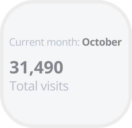
The customization for individualization
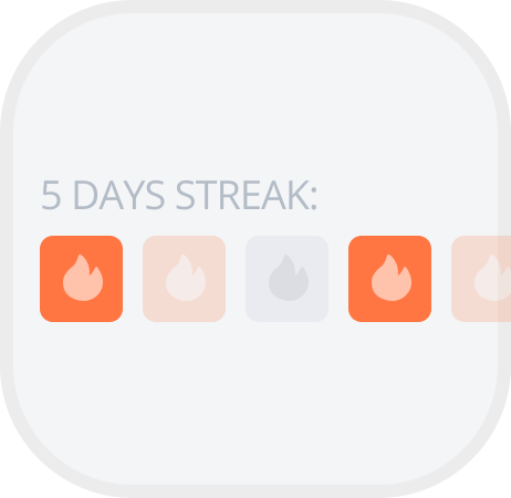
Results of 5 days in a row
Among all the Tipsters
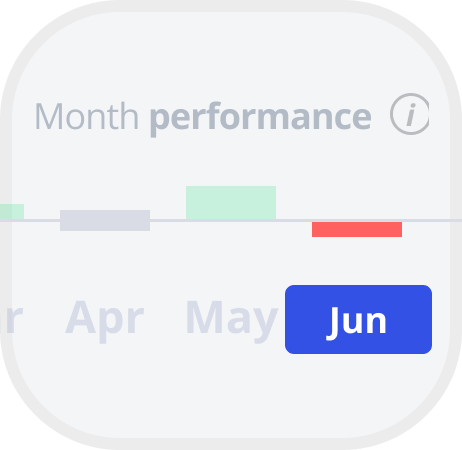
Monthly display
Number of bets in a specific period of time
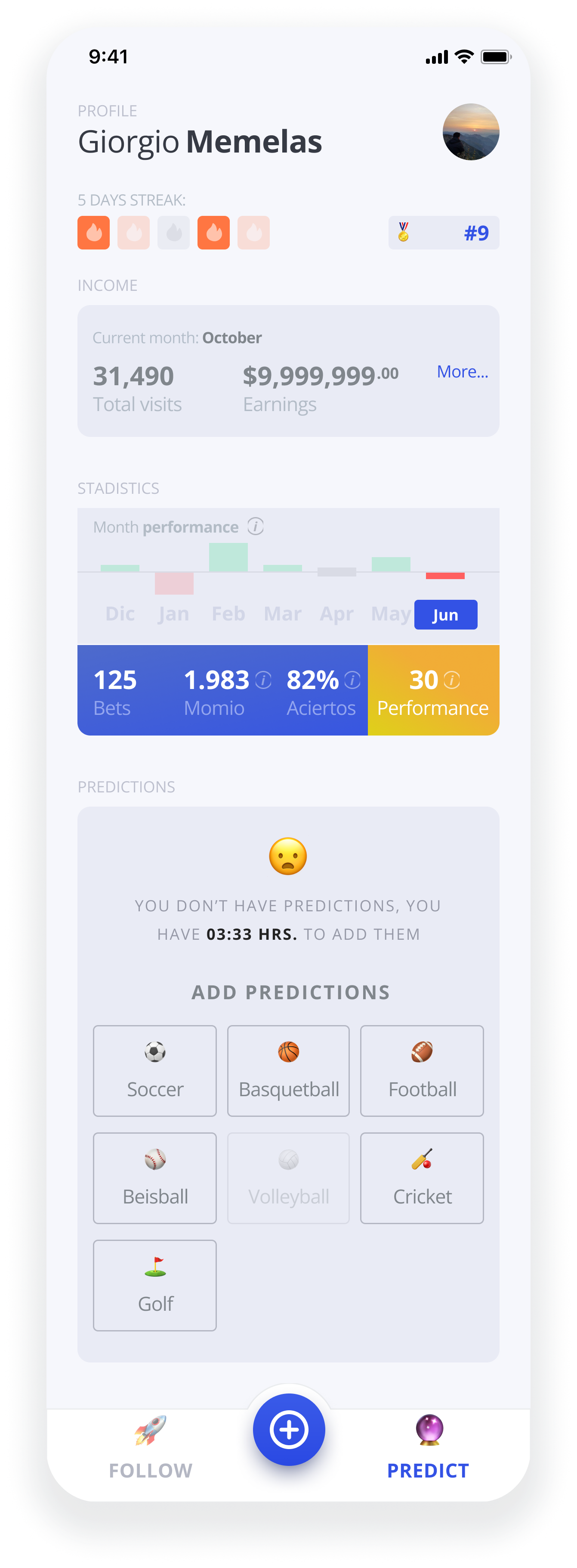
Final version
The functionalities that would improve the UX from previous explorations:
The 5 days streak weren’t there and it was on the top 5 components.
Letting the Tipster now about specific insights at a glance had a major relevance.
The statistics were made interactive to let the Tipster navigate through different months at a tap.
Creating predictions while defining the sport right from the dashboard to improve the speed of their creation.
The main CTA focuses on the main task of the Tipster: create a prediction. This menu would had a fixed position.
We decided that our Tipsters would also be able to FOLLOW other tipsters and not only create predictions.
Editing existing predictions
Once predictions were created, the Tipster would be able to: create more predictions, delete previously created predictions and edit predictions as well:
Whenever the Tipster opened the app the first thing they will see is the time left to predict, confirmed predictions and a CTA to edit the ones already made.
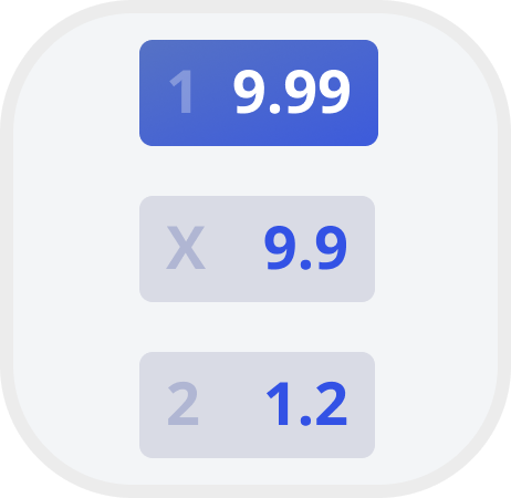
Editing a prediction is quite simple as the Tipster only has to choose the result. Momios of each result are displayed.
One improvement would be to save each change on the go instead of having to confirm all the changes made.
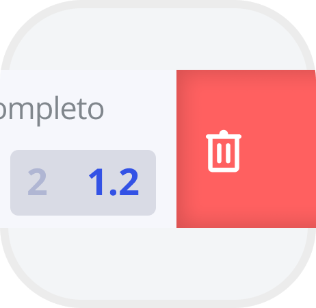
Deleting a prediction would require the Tipster to drag the prediction and confirm the deletion of it.
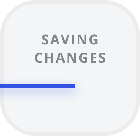
A loader was added to provide feedback to the user about not being able to continue interacting until the process finishes.