😅

Size matters!

Please don’t review my portfolio on this small screen, as it is not yet developed to manage responsiveness, he.


Here, have a burrito 🌯 for your journey thorough your desktop.


A FREELANCE AND AN UI NEED

An interesting journey of designing a mobile app as a freelancer

I was invited to participate in the development of a mobile app as a UI designer, occasionally contributing in the UX domain by implementing improvements.


The concept was straightforward: "We need an app that fosters a community of readers, where they can create their virtual bookshelves and share their thoughts on books."


The user problem and wireframes of 40 flows where already defined.

My role Platforms
· Project manager
· User Inerface Designer
· UX Designer

Background

The client had been planning this idea for a long time to the point where the design colors and style was somewhat defined but still there was room to contribute.


The Challenge

The deliverables where clear: UI Library and 40 different flows. The timeline and checkpoints with the stakeholders were defined.


The most complex part was to define the main 6 flows that would contain approximately 80% of the needed components.


— 40 flows and a deadline were defined —

Design Process

  1. Design fundamentals were defined; such as principal colors, user flows, interaction and arrangement of elements.

  2. I wanted to facilitate some of the workflow and got a UI template, despite this decision there were tons of tweaks and fixes that needed to be done in order to achieve the expected outcome of each flow. But nonetheless it would save some time by defining the elements within certain components and pages.

  3. The wireframes were really clear and made a lot of sense, so this project would let me focus almost 100% in delivering an eye candy UI.

  4. After finishing certain main flows and having a checkpoint with the stakeholders there were the need to implement a few improvements that were added lately.

  5. An interactive prototype and a Figma file with every documentation within it where the deliverables.

High Level Steps


Concept

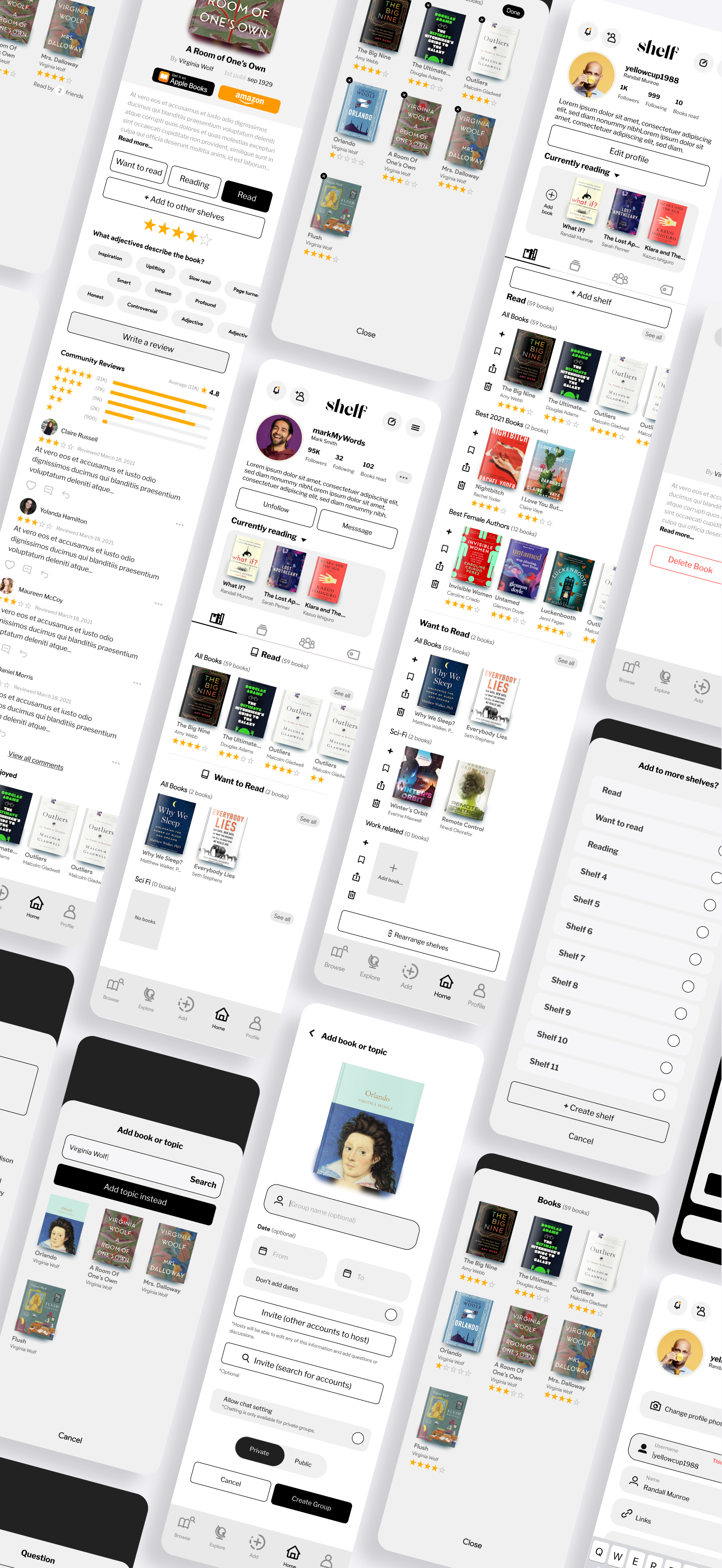
The core of the app is to build a community by letting users create their profiles where other users would be able to see the books they are reading, the different shelves they have and the reviews they have, create events, create groups to chat and share opinions.


Design Components

Default shelves

Where the user could save plenty of books. There where 2 default shelves: Read and Want to Read. The user would not be able to delete these two.


Extra shelves

The user would be able to create more shelves as it pleases. These will be editable by name and deletable. Also arrangable (order) and will be able to contain subshelves as well.


Currently reading

Pretty straightforward: the books the user is currently reading would be added here to keep a track of them and for their followers to know.


Give it a Try!

Here is the interactive prototype for you to navigate through the whole app:


Previous


From Have to to Want to

Next


We Need More Users